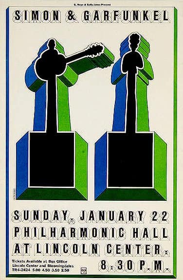
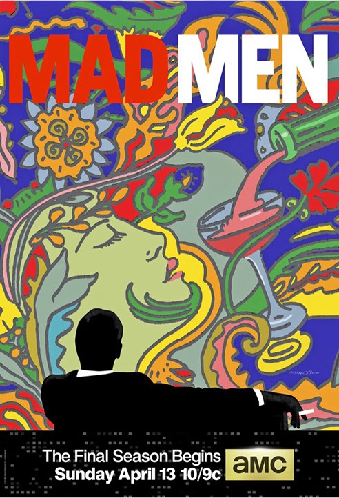
If they’re talented and they’re lucky, designer-artist-creators get to lob an icon out into the larger culture — Leo Fender’s Stratocaster guitar, say, or Shepard Fairey’s Obama poster.
If they’re great, maybe they create two. Milton Glaser, though, operated on another plane — he just kept hitting the bull’s-eye, again and again, throughout his extremely long career as an illustrator, graphic designer, art director, and visual philosopher and paterfamilias.
He loved New York City, and celebrated it in multiple ways: with a magazine, with posters, and (most visibly of all) with the three-letters-and-a-red-heart slogan he created. Almost incidentally, he also changed the way you eat.
Milton Glaser died yesterday, on his 91st birthday, of natural causes after an extremely long and productive career.
Milton Glaser died yesterday, on his 91st birthday, of natural causes after an extremely long and productive career.
Around our office, of course, he will forever be one of the small team of men and women that, in the late sixties, yanked New York out of the newspaper morgue and turned it into a great American magazine.
In 1966, the Esquire alumnus Clay Felker had been editing the Sunday supplement of the New York Herald Tribune — which was called New York — when the paper shut down.
It came back for a few months at a merged entity called the World Journal Tribune, until that paper also crashed and burned. Over the next year, Felker and Glaser devised a plan to reincarnate it on its own, as a weekly glossy magazine, using the best and most inventive writers from the Trib and Esquire and various other places.
 |
| Glaser’s poster teeing up the launch of New York magazine, 1967. |
It was a near-starvation operation when they launched in the first week of April 1968, and it was also a hit. New York soon became the hottest and liveliest magazine in America, in large part because Glaser’s design was crisp and understated and bright and poppy.
He drew the logo appearing at the top of this very webpage, which has been tweaked over the years but is fundamentally still the same one that appeared on the cover of Vol. 1, No. 1.
If you met him, you will probably have been struck by his voice, which was deep and chesty, simultaneously aristocratic and grounded, elevated in tone but capable of operating at street level.
With his distinctive and gradually graying beard, he served as the cerebral, vaguely rabbinical foil to Felker, who could be, for all his better qualities, a shouty and mercurial boss. Felker would yell, Glaser would rumble back, and something good usually came of it. Their employees nicknamed them the Twin Towers.
Unlike Felker, he’d been a New Yorker from the beginning.
Born in the Bronx on June 26, 1929, he was a public-school kid of the stickball generation, the son of Jewish immigrants from Hungary.
After graduating from Cooper Union, Glaser first made a splash as part of a small confederation of illustrators called Push Pin Studios.
There, along with his art-school friends Edward Sorel, Seymour Chwast, and Reynold Ruffins — all of whom are still active — they were at the leading edge of their field, as the taste in illustration for magazines and ads changed from a brushy, painting-driven realism to a curvy, bright, cartoony approach.
Maybe it was because they had come of age with comic books; maybe it was just more purely American, New Yorky, ethnic, what-have-you.
It looked fresh and modern, but it was also art-history-literate: Glaser had borrowed the black silhouette profile from a portrait of Marcel Duchamp (a lift that he readily admitted).
Even the typeface was his own, a font called Baby Teeth. MoMA has a copy of the poster in its permanent collection—it makes regular appearances in the design collection — and Glaser’s studio still sells reprints of it.
The Push Pin aesthetic (not to mention its talent roster) is on full view in the early issues of New York, partly because Glaser did so very much work in its pages.
He was always prolific, but never more so than he was then, because the startup magazine was perpetually broke and continually scrambling. If he and Felker didn’t have a cover 24 hours before going to press, Glaser would just sit down and draw one.
You can go through them in a couple of books — and you should consider, as you do, how fresh those bright fields of color and psychedelic forms looked around 1970.
“Speed City”— that snake, with its biblical implications as well as its venomous ones, suggests invitation along with menace.
Who else would turn an old Jewish joke—the one that ends “Of course he can walk. Thank God, he doesn’t have to” — into a magazine cover?
In 1977, he got the one job that would end up even more widely seen than the Dylan poster.
After the city’s fiscal crisis of 1975, New York State was pushing tourism with a big ad buy and a new jingle, and asked Glaser to propose a logo.
The story goes that he had had presented an idea to the executives that was okay, and came up with a better one afterwards one in the New Yorkiest place on earth: the backseat of a yellow cab. (Walk? Thank god he didn’t have to.)
Four characters, scribbled in red crayon on a torn envelope: I ♥ N Y. It was just off-kilter enough — you tend to read it as “I Heart Enn Wye” on the first try — to be exactly right.
A billion coffee mugs and T-shirts followed. Because it was designed for the city he loved and a campaign that seemed temporary, Glaser did it pro bono, and he seems to have enjoyed the endless number of permutations, parodies, and ripoffs it has spawned.
The torn envelope from the taxi ride is also in the permanent collection of MoMA.
A sequel, designed after the 9/11 attacks, became yet another icon.
They quit immediately (as did much of the staff), and Glaser went back to doing design work full-time.
 |
There was a ton of it, from more posters — there are hundreds of them, for concerts, museum shows, social movements, and much more — to branding work for Grand Union supermarkets to, yes, a Trump Vodka bottle.
And in those years, he made still another prescient call. In the mid-1980s, Steve Hindy and Tom Potter, the founders of a new microbrewery, came to him for a logo design.
Glaser took a look at their proposed name — Brooklyn Eagle, recalling the defunct newspaper — and, as he told the story, he offered one key bit of advice.
“Anheuser-Busch already has the eagle,” he told them. “You’ve got Brooklyn. That’s enough!”
Brooklyn Brewery, with its swoopy baseball-jersey logo evoking both the departed Dodgers and a swirl of beer foam, made its debut in 1988.
Because it was a startup without much money, Glaser took a stake in the company instead of a fee.
Today, Brooklyn Brewery is a huge global brand — and, as Glaser told me a couple of years ago, that was the thing that made him financially independent, enough to keep him in taxicabs and then some, enthusiastically sketching, for the rest of his life.
“Of all the work I’ve done!” he said, chuckling, in that inimitable voice.
UPDATE
"Art is work" on YouTube


This comment has been removed by the author.
ReplyDelete